Scooby’s — Where Love Checks In
Every wag has a story — and Scooby’s was designed to tell them all.
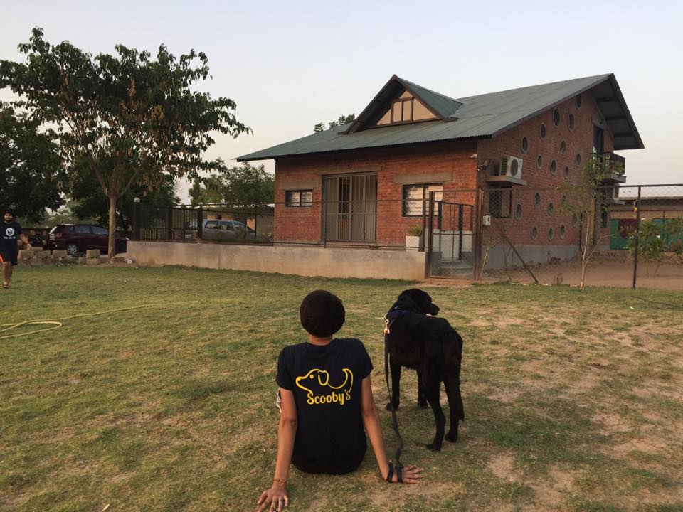
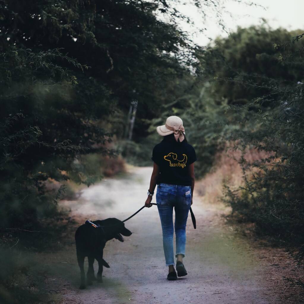
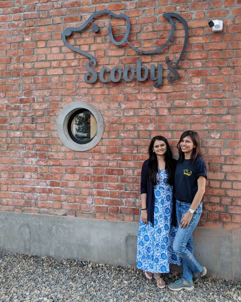
Design Equation created a warm, playful brand identity for a dog resort built on care, comfort, and companionship.
The logo captures joy in its simplest form — a single continuous line forming a dog’s silhouette, symbolizing trust, motion, and affection. The cheerful yellow tone radiates warmth, happiness, and optimism — mirroring the energy of playful paws and wagging tails. The friendly typography, with its rounded edges, adds a hint of mischief and friendliness — much like the guests who stay there.
The visual language extends into every brand touchpoint — cheerful signage, cozy merchandise, and a welcoming digital palette. Each element reflects Scooby’s mission: to create a space where every dog feels at home, and every owner feels peace of mind.
For Design Equation, Scooby’s was about designing not just for a brand, but for the boundless heart of a four-legged friend.